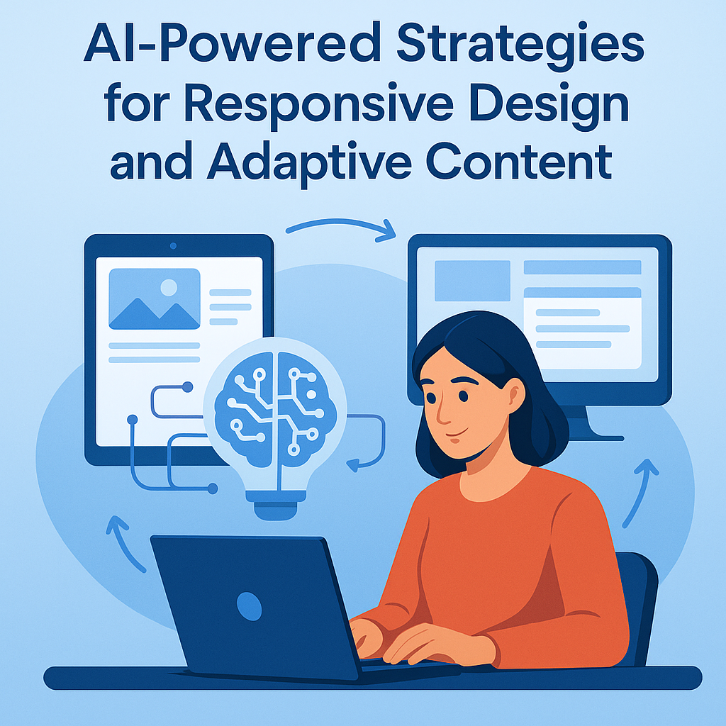
Why Responsive Design and Adaptive Content Matter
In the age of mobile-first indexing, users expect seamless, fast, and visually appealing experiences across all devices. Websites that don’t adapt to different screen sizes and user environments not only frustrate visitors but also suffer in search engine rankings. That’s where responsive design and adaptive content come in.
Responsive design ensures that your website layout dynamically adjusts to screen sizes, while adaptive content changes depending on the user’s context—device, behavior, or preferences. But managing both across hundreds of pages can be complex. That’s why smart marketers are increasingly turning to AI-powered strategies to automate, optimize, and scale responsive and adaptive experiences.
The Role of AI in Responsive Design
1. Automated Device Detection and Layout Optimization
AI-powered platforms can instantly detect a user’s device, screen resolution, orientation, and even bandwidth. Using this information, AI tools can serve the most suitable layout variation—without the need for hard-coded breakpoints or manual testing across device types.
For example, AI-driven UI frameworks can automatically adjust:
- Font size and line spacing for readability
- Image dimensions and resolution
- Menu layout (e.g., hamburger on mobile vs. full navbar on desktop)
- Interactive elements like buttons, forms, or sliders
This level of automated optimization improves usability, keeps users engaged, and reduces bounce rates.
2. AI-Powered A/B and Multivariate Testing
AI excels at testing design variations at scale. Tools like Google Optimize (combined with AI-enhanced platforms) can automatically run A/B or multivariate tests on different layouts and determine which performs best across devices. You don’t need to guess what version works better on tablets vs. smartphones—AI uses real-time data to decide.
It can test variables such as:
- Button placement and size
- Image-to-text ratios
- Mobile-friendly header layout
- Content prioritization for mobile views
This not only saves time but ensures your responsive design continuously evolves based on data, not assumptions.
How AI Powers Adaptive Content Strategies
1. Content Personalization Based on User Data
Adaptive content means showing the right content to the right user at the right time and on the right device. AI can analyze behavioral data like:
- Location
- Time of day
- Device type
- Past interactions
- Session history
Using this data, it can personalize:
- Headlines and CTAs
- Recommended blog posts or products
- Pricing options or offers
- Language and tone of content
For example, a returning mobile user might see a shorter, snappier version of a long-form article, while desktop users get the full version.
2. Natural Language Generation for Dynamic Messaging
AI tools like OpenAI’s GPT models or Persado can dynamically generate tailored headlines, product descriptions, and content summaries that adapt to the device and user’s intent. These tools use Natural Language Generation (NLG) to ensure the copy fits the user context, tone, and desired length.
Example: A product page headline may be:
- “Lightweight, Durable Travel Backpack” for desktop
- “The Ultimate Backpack for Travel” on mobile
- “Your Next Adventure Gear” via email
This level of micro-personalization boosts engagement and conversion rates.
Enhancing UX with AI-Driven Micro-Interactions
Micro-interactions are small design moments that guide or delight users—think loading spinners, swipe effects, or subtle animations when a button is pressed. AI helps optimize these moments in real-time.
Predictive Behavior Modeling
By analyzing mouse movement, tap behavior, and scroll depth, AI can predict what users are likely to do next. Based on these predictions, AI can:
- Trigger animations at the right moment
- Offer tooltips or help text proactively
- Preload content likely to be viewed next
- Optimize swipe gestures on mobile
These enhancements don’t just look good—they guide the user journey and reduce friction, especially on mobile.
AI-Enhanced Media Optimization
1. Smart Image Compression and Delivery
AI tools like Cloudinary or ShortPixel use machine learning to automatically compress images for faster load times based on the device’s screen size and internet speed. AI can also convert images to next-gen formats (like WebP or AVIF) without loss of quality.
This results in:
- Faster page loads
- Higher Core Web Vitals scores
- Improved mobile experience
- Lower bounce rates
2. Adaptive Video Streaming
AI can analyze bandwidth and device specs to stream videos in the most appropriate format and resolution. Platforms like Mux or Vimeo OTT use adaptive bitrate streaming enhanced by AI to avoid buffering and optimize video delivery.
Intelligent Navigation for Different Devices
AI-Powered Menus
Traditional navigation menus don’t always scale well on mobile. AI can track common user paths and dynamically rearrange or simplify navigation items for specific devices. This ensures that the most-used pages are the easiest to find.
Voice- and Gesture-Based Interfaces
AI is increasingly being used to support emerging interaction methods such as:
- Voice navigation: Using NLP to let users search or command the site hands-free
- Gesture recognition: Especially in apps and web interfaces built for accessibility
Both contribute to inclusive design, another pillar of a responsive and adaptive user experience.
How to Implement AI Strategies for Responsive & Adaptive Design
Step 1: Choose the Right AI Tools
Here are some useful AI-powered platforms:
| Function | Tools |
|---|---|
| Automated UI Adaptation | Wix ADI, Framer AI, Builder.io |
| Personalization | Mutiny, Adobe Target, RightMessage |
| Image Optimization | Cloudinary, ShortPixel, TinyPNG |
| Content Generation | OpenAI GPT-4, Jasper, Copy.ai |
| Testing & Analytics | VWO, Optimizely, Crazy Egg AI heatmaps |
Step 2: Use AI Plugins or Integrations
For WordPress and other CMS platforms, consider plugins like:
- Bertha.ai – content adaptation
- NitroPack – performance & adaptive optimization
- RankMath + OpenAI – meta tags + responsive SEO recommendations
Step 3: Continuously Train and Improve
AI is most effective when it’s constantly learning. Feed it real-world data from Google Analytics, Search Console, and heatmaps so it can:
- Adapt layouts based on performance
- Refine content personalization models
- Recommend updates to older designs or sections
SEO and Accessibility Benefits
Responsive and adaptive design doesn’t just improve UX—it boosts SEO:
- Mobile-first indexing: Google ranks mobile versions first
- Lower bounce rates: Happier users stay longer
- Higher engagement metrics: Personalized content = more clicks
- Better accessibility: Adaptive interfaces can meet WCAG guidelines, which Google rewards
AI simplifies the effort to achieve all these outcomes at scale.
Final Thoughts: AI as the Bridge Between Design and UX Excellence
AI is rapidly transforming how we approach responsive design and adaptive content. Instead of relying on rigid layouts and one-size-fits-all messaging, businesses can now automate intelligent design choices based on real-time user behavior and preferences.
By using AI tools strategically, you can create a website that doesn’t just look good on every device—it performs better on every device.